Top 10 Golden rules of great website design
How to design a Website: The top 10 things you need to know
Struggling to design a website?
Spending long hours coding leading to insignificant changes?
Website builders just not doing it for you?
If you answered yes to any of those questions, this page is for you.
This article summarises everything you need to know about website design and gives you all the tips you need to make your own, beautiful and fully functional website in just 10 sections.
The 10 principles of great website design can be broken down as:
- Branding
- Colours
- Fonts
- Formatting
- Visual Cues
- Graphics
- User Experience
- Messaging
- Debugging
- Social Proof
Understanding these principles will give you an understanding of basic web design.
Reading this page will give you enough information to design a website that draws people in, keeps them engaged and reduces the steps needed to achieve a conversion such as a newsletter sign up or sale.
Brilliant Branding
A great brand is distinctive yet memorable, has a fitting brand personality and brand image for their industry and is consistent across all channels.
Example: Nike.
Nike is short, distinctive and easily memorised. Ask anyone what their slogan is and they’d say ‘Just do it’.
Their brand personality is centered around being inspiring, motivational, cool and exciting.
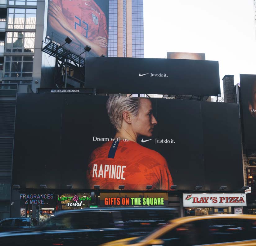
Imagine if Nike were a person. They’d be the friend you always go to whenever you need some motivation to get your fitness journey back on track, and they would be with you every step of the way.
Look Nike up on any channel and you’ll see they still convey those aspects of their brand personality with every bit of content posted.
As soon as you can you need to create a brand package- this will include everything anyone needs to know about your brand so you remain consistent in all of your posts and other web pages.
Creative Colours
So we know you need to be consistent- and this includes the colours you use. The colours you use are very important, and will form part of your brand package.
In general, you want about 2-3 colours (Don’t worry, this doesn’t include shades like black and white) to use in all your branding. That's enough colours to be creative with your layout and be attention grabbing, but won’t make your website look super busy.

Example: Amazon
Amazon uses three colours: Orange, light blue and dark blue.
In addition to shades of grey this gives them enough variation to highlight their logo and separate their content to be visually appealing.
If you’re just starting out with design and need help choosing what colours you want to use, we recommend Colour Lovers.
It’s a great site where you can choose an initial colour and what kind of composition you like best. There’s no need to stick to their exact combination, but it’s a great place to go if you need a starting point.
Fantastic Fonts
Typography is a great way to grab attention and can work as a visual representation of your brand’s voice.
Using any more than three font’s will make your design look odd.
You should determine what fonts go where too - such as one for your titles, one for your body, and one to highlight figures or facts. Have a look through the Harrods website for inspiration of what fonts they use, and where.
You should be careful with the fonts you intend to use though- some computers may not have the font you want to use, so it will change the font to something the user does have, but it may not work with your brand. This site shows what fonts are compatible with Windows and Macs.
There are several ways you can go around this. You can:
- Set a fallback font which is either a specific font, or something broader like ‘Serif’, at which point the user’s PC will look through its existing fonts to find one that has that word in it.
- Use a font from a site which will render the fonts automatically. Google fonts is a free option, and Adobe Fonts is paid, but offers other font options.
- Upload the font onto your web server.
- Use the fonts you want, placed on an image and saved in an image format like JPEG.
All of these options will work, however they all have different advantages and disadvantages. Here’s a table which shows it more clearly.
|
Can be read by Google |
Will have brand consistency |
No limitations on fonts available |
Will always display the font you want |
|
|
Use your own uncommon font |
Yes |
No |
Yes |
No |
|
Set a backup font |
Yes |
Depends how similar backup is |
No |
No |
|
Use a font from something online that can be licensed e.g. Google Fonts |
Yes |
Yes |
No |
Yes |
|
Upload a font on a Web Server |
Yes |
Yes |
Yes |
Yes |
|
Use font on image |
No |
Yes |
Yes |
Yes |
As this table shows, the best option to maintain brand consistency whilst giving you the option to use custom fonts to help you differentiate your brand is to upload your fonts onto your website server.
Though using fonts on an image appears to have many advantages too, the text you use can’t be crawled by Google which will have a negative impact on your SEO - learn more here.
Additionally, it may be rendered badly. The font could appear aliased visually. This means the edges of the letters become jagged and look very poor quality.
Fabulous Formatting
The layout of your site will impact readability, user friendliness and how visually appealing it is.
There are a few rules to follow when laying out the formatting of the site, such as organising placements of content so they don't fall in gutters.

Gutters are invisible lines, usually at 20px per gutter, which many designers use to make layouts look good. Even though they’re not visible in the final design, they instruct designers where to place their elements and make sure it still looks good, and leaves space for other elements.
There are four common grid layouts which can help informat designers how to layout a web page. These are Block grids, column grids, modular grids and hierarchical grids. This site has some great information if you want to know more about these.
Another important formatting tip is to keep your pages long. Doing this means your website visitors are more likely to stay engaged with your site content and find the information they want easily.
If you were talking with a potential client you wouldn't suddenly stop answering their questions. The only thing a short page does is stop answering questions.
Very-useful Visual Cues
Visitors to a site will look from left to right, however there are ways to break up this visual ‘laziness’ if it works better with your site, or if you want to direct attention to certain pieces of content first.
There are a few tools you can use to highlight anything you wish to have more visual prominence and be seen first as shown on this table, which takes inspiration from Orbit Media’s table but adds extra, useful information.
|
Low visual prominence High visual prominence |
|||
|
Position |
Page bottom |
Page top |
|
|
Size |
Small |
Medium |
Large |
|
Colour |
Low contrast, muted colours |
Strong contrast, distinguishing colours |
|
|
Format |
Text |
||
|
Font Styling |
Normal |
Italic |
Bold |
|
Position relative to other content |
Crowded page |
Surrounded by whitespace |
|
The above tips focussed more on changing the actual thing you wanted to change, but if you’d rather you can use graphics around a piece of content to highlight it.
You’ve seen them everywhere: arrows. It’s a simple technique, but effective. If you use them, the eye will naturally follow the line to wherever it goes - especially if it's an animated line.

You can be really creative with these, too! You could have an arrow made of a shoelace if you're advertising trainers, or a train track if you’re advertising a travel agency (though you may say that's a line, it's still an arrow- It just doesn’t have a normal arrowhead.)
Other ways to use visuals to direct attention is to use people. By having photos of people looking in a certain direction at your writing, or looking at a product, visitors to the site will naturally look that way too. There’s tons of research using eye-tracking software to back this up, so if this technique works for your business we’d definitely recommend it.
Great Graphics
Speaking of graphics, the ones that you use have to be picked carefully. They need to be consistent, and you need to use white space to make sure they have enough room to ‘breath’.

White space is empty space between content. It can help things stand out as elaborated on in the next section, but it also aids in readability and makes for a more pleasant user experience.
Graphics also have to be consistent - A web page will look messy with many different kinds of graphics, such as by using different animation styles (e.g. styles as a cartoon vs anime vs comic).
Uber-Good User Experience
The visuals of your website are important, but something for more importance is how intuitive and easy it is to use.
We have a great article here which goes into detail about user experience design (UXD), why it’s so necessary to build a website with great UXD and what kind of visuals and features make a good website great.
Marvelous Messaging
Copywriting
The copy (words which make up your written content) in your site has to be spot-on to achieve any of your goals, whether that’s app downloads, lead generation or sales.
In the ‘Brilliant Branding’ section we mentioned the brand image has to fit the industry it’s in, and the messaging has to fit that too.
You can find out about how to make sure your website copy fits in the industry by looking at competitors’ sites. Though that’s a great way to start out, we’d recommend doing some target market research before writing anything.
This is so that your content fits with what your target market wants- and answers all the questions they have. After all, your competitors could be doing the completely wrong thing!
When writing, you’ll want to avoid using jargon as much as possible. If people don’t understand, or are struggling to read your content they’re likely to give up- attention spans are getting shorter everyday.

Because attention spans are so short, you’ll also want to keep your sentences short, and to the point. Long paragraphs are also a big no no. They’re on your site to quickly find the information they need, not to read a novel.
Calls to action
To achieve your goals you have to have call to actions (CTA’s) on your site, which will instruct visitors on what to do next.

These should have good visual prominence, however not be so overwhelming they distract from the rest of your content and be positioned frequently throughout the page, so whenever a user is ready to move on, they don’t have to look for to know what to do next.
Though you may be tempted to add multiple CTA’s, this will only make visitors confused on what to do next, and make your site appear too ‘salesy’, driving potential customers away.
Delightful Debugging
There is no point having a beautifully designed website if it doesn’t work. Test your links- get other people to test everything, on different platforms too.
This will help you avoid losing hard-earned traffic, and it will boost your SEO too! Getting people to look through your site is never a waste of time.

Even if everything works perfectly, it’s likely there's going to be some information missing that your clients need that you didn’t even think about. If you can, get someone from your industry on the client side to go through your site and give you feedback on its design, functionality and information available- This will contribute to your UXD.
Superb Social Proof
Social proof is evidence people have purchased your product or service and found value in it. Word-of-Mouth (WOM) is so effective because it is social proof. People are more likely to buy something that’s been recommended- don’t you look at reviews before buying something?
If you have reviews- that’s great! Use quotes or the star rating in your advertising materials and around your website.

You’re not lost without reviews though- you can create case studies where you write about how your product or service helped someone or a company, and what benefits they got from it. Additionally, you can also hire influencers to promote your brand, then put that on your site or use photography of people using your product/ service.
For example, we have some great reviews on Google which we use quotes from in our advertising materials and we have case studies on this site to add social proof our services are trustworthy and high-quality.
Top 10 website design tips roundup
If you follow these 10 golden rules to website design you’ll have a great start to making a website with a great conversion rate (the percentage of people visiting your site that make a conversion like making a sale).
The effectiveness of these tips will change depending on the industry you’re in, so it’s still important to do lots of research into your target market.
We hope you found this article useful, if you’d like a free website review we can provide you one, just fill out your details at the bottom of this page.

Author
About
Marketing executive at Royal Wares.